PAYROLL SAAS
2026
Paybooks Pricing Page
Turning a price list into a qualified-lead engine — matching HR to the right plan, and quietly steering them toward managed payroll.
Web
Responsive
PAYROLL SAAS
2026
Paybooks Pricing Page
Turning a price list into a qualified-lead engine — matching HR to the right plan, and quietly steering them toward managed payroll.
Web
Responsive

Role : UX/UI Designer (research → design → shipped)
Team : Solo, with marketing, sales & customer support
Company : TransPerfect
Timeline : 3 weeks (end - to- end)
Platform : Web — desktop, tablet, mobile
Role : UX/UI Designer (research → design → shipped)
Team : Solo, with marketing, sales & customer support
Company : TransPerfect
Timeline : 3 weeks (end - to- end)
Platform : Web — desktop, tablet, mobile
Project Overview
A pricing page usually answers one question: what does it cost? This one had a harder job — qualify a visitor, match them to the right Paybooks plan, and hand sales a warm lead with contact details. Price was never the point. Fit was.
Project Overview
A pricing page usually answers one question: what does it cost? This one had a harder job — qualify a visitor, match them to the right Paybooks plan, and hand sales a warm lead with contact details. Price was never the point. Fit was.
The brief
Two goals sat under the redesign: generate qualified leads, and steer buyers toward managed payroll rather than self-serve. I was originally handed a smaller task — reskin the existing page with the current content. It didn't stay small.
The brief
Two goals sat under the redesign: generate qualified leads, and steer buyers toward managed payroll rather than self-serve. I was originally handed a smaller task — reskin the existing page with the current content. It didn't stay small.
Research & discovery
I started with the buyer, not the layout — and I did the bulk of this myself. HR teams land on a payroll page carrying a pile of questions, and I wanted the real ones, so I went to the people who hear them every day: marketing and customer support. Picking apart those actual HR conversations surfaced the questions the page truly had to answer, and in what order. Early notes stayed raw and scattered on purpose — volume of truth first, structure later.
It began analog — sketches and notes on paper — before I moved into Figma and drafted a user persona from those insights, AI-assisted. Paper to think, Figma to sharpen. The persona gave every later decision a person to answer to.

Doing this legwork myself was the point: it built enough context and conviction to direct the design precisely later, instead of leaning on AI to think for me.
Research & discovery
I started with the buyer, not the layout — and I did the bulk of this myself. HR teams land on a payroll page carrying a pile of questions, and I wanted the real ones, so I went to the people who hear them every day: marketing and customer support. Picking apart those actual HR conversations surfaced the questions the page truly had to answer, and in what order. Early notes stayed raw and scattered on purpose — volume of truth first, structure later.
It began analog — sketches and notes on paper — before I moved into Figma and drafted a user persona from those insights, AI-assisted. Paper to think, Figma to sharpen. The persona gave every later decision a person to answer to.
Doing this legwork myself was the point: it built enough context and conviction to direct the design precisely later, instead of leaning on AI to think for me.

From brief to spec
Intent became a plan before any frame was drawn. Marketing handed over a PRD, and I used Claude to draft the content map from it — what goes in each section, what it needs to say, and the goal it serves. That gave me an agreed brief for every block up front.

From brief to spec
Intent became a plan before any frame was drawn. Marketing handed over a PRD, and I used Claude to draft the content map from it — what goes in each section, what it needs to say, and the goal it serves. That gave me an agreed brief for every block up front.
The pivot
Mid-project, the ground moved. Internal discussions pushed plan prices up sharply — enough that leading with price would now do the opposite of the goal and scare buyers off the page.
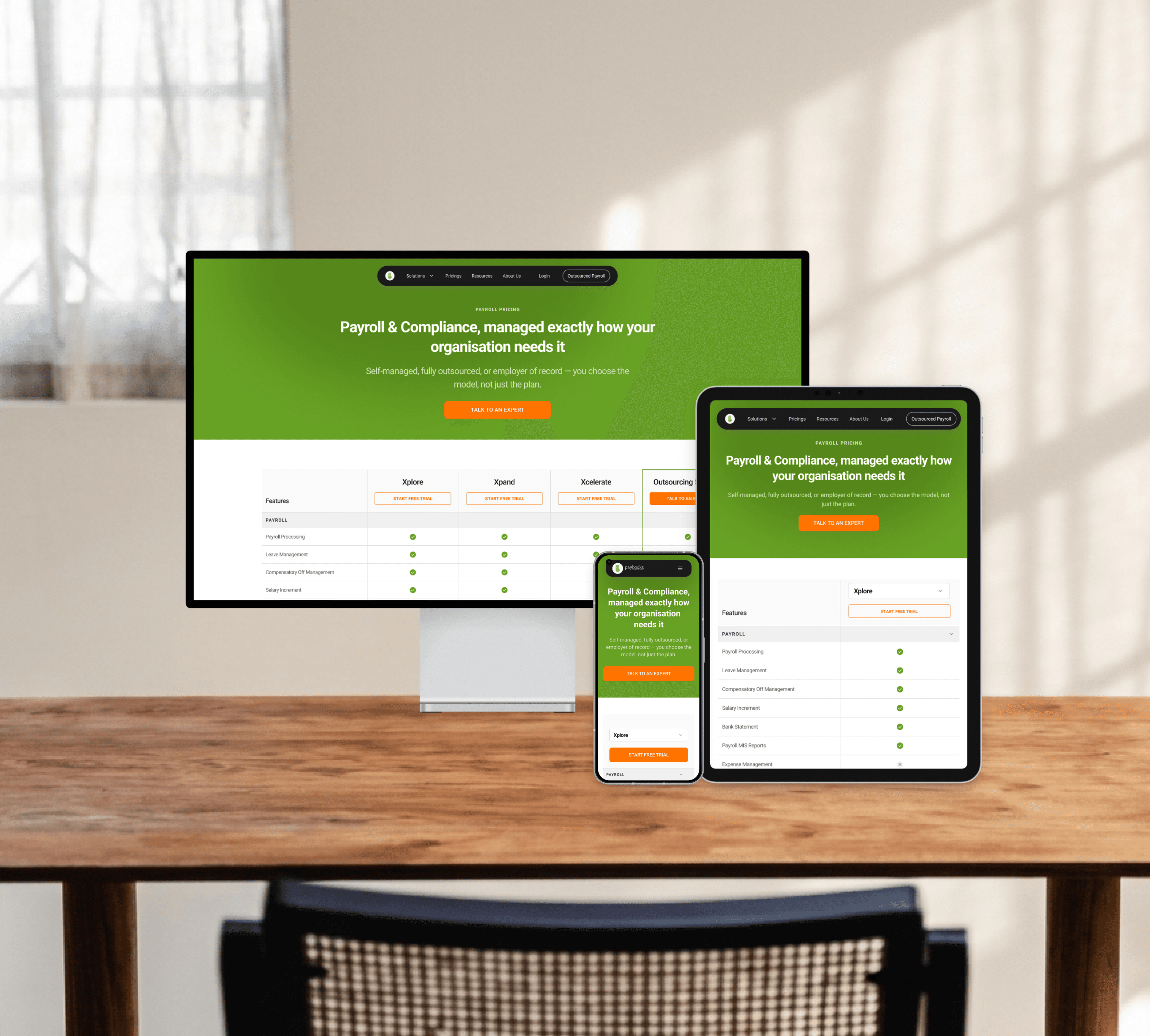
That reframed everything. Don't show the price — show the difference. The page shifted from a price list to a plan feature-comparison: let HR see what each tier actually does, feel the pull of the managed option, and reach out — before cost ever enters the conversation.

The pivot
Mid-project, the ground moved. Internal discussions pushed plan prices up sharply — enough that leading with price would now do the opposite of the goal and scare buyers off the page.
That reframed everything. Don't show the price — show the difference. The page shifted from a price list to a plan feature-comparison: let HR see what each tier actually does, feel the pull of the managed option, and reach out — before cost ever enters the conversation.
Structure & exploration
I rebuilt the sitemap from the ground up so every section earned its place, then pressure-tested it with stakeholders section by section. The design loop leaned on AI to move fast without cutting corners:
Mobbin → Figma via Claude (MCP) to pull real-world references and screenshots straight into the file
Multiple iterations per section, then narrowed to a short list
Floto AI to test the designed screens against the user persona and pressure-test the flow
Freeze, once marketing and business stakeholders signed off

Structure & exploration
I rebuilt the sitemap from the ground up so every section earned its place, then pressure-tested it with stakeholders section by section. The design loop leaned on AI to move fast without cutting corners:
Mobbin → Figma via Claude (MCP) to pull real-world references and screenshots straight into the file
Multiple iterations per section, then narrowed to a short list
Floto AI to test the designed screens against the user persona and pressure-test the flow
Freeze, once marketing and business stakeholders signed off
Structure & exploration
I rebuilt the sitemap from the ground up so every section earned its place, then pressure-tested it with stakeholders section by section. The design loop leaned on AI to move fast without cutting corners:
Mobbin → Figma via Claude (MCP) to pull real-world references and screenshots straight into the file
Multiple iterations per section, then narrowed to a short list
Floto AI to test the designed screens against the user persona and pressure-test the flow
Freeze, once marketing and business stakeholders signed off
Design system
Everything sat on a proper foundation — components and a style guide built in Figma — so iteration stayed consistent instead of drifting.

Design system
Everything sat on a proper foundation — components and a style guide built in Figma — so iteration stayed consistent instead of drifting.
Responsive & shipped
Mobile and tablet are only ~10% of traffic — which was the real fork: was pixel-perfect effort there worth it? I decided yes. A dropped-out layout on a lead-capture page is a lost lead regardless of device share, so I designed those breakpoints deliberately instead of letting them fall out of the desktop grid.
For the last mile I used Claude in the terminal to import all three breakpoint designs — 1440px, 768px and mobile — and code them into responsive HTML/CSS, correcting its content and layout mistakes with targeted instructions along the way. The result went to the dev team to deploy.
Responsive & shipped
Mobile and tablet are only ~10% of traffic — which was the real fork: was pixel-perfect effort there worth it? I decided yes. A dropped-out layout on a lead-capture page is a lost lead regardless of device share, so I designed those breakpoints deliberately instead of letting them fall out of the desktop grid.
For the last mile I used Claude in the terminal to import all three breakpoint designs — 1440px, 768px and mobile — and code them into responsive HTML/CSS, correcting its content and layout mistakes with targeted instructions along the way. The result went to the dev team to deploy.
Where judgment stayed mine
AI was for exploration and speed; the decisions were mine. I made the final call on every section, curated hard rather than accepting generations, and drove the strategy — hiding price, the feature-comparison model, the retention play. None of that came from a tool. And because I'd built the context myself, I could instruct the AI with precision — targeted, specific, nothing wasted. AI compressed the distance between idea and artifact; judgment stayed on top.
Where judgment stayed mine
AI was for exploration and speed; the decisions were mine. I made the final call on every section, curated hard rather than accepting generations, and drove the strategy — hiding price, the feature-comparison model, the retention play. None of that came from a tool. And because I'd built the context myself, I could instruct the AI with precision — targeted, specific, nothing wasted. AI compressed the distance between idea and artifact; judgment stayed on top.
The retention play
New visitors were only half the story. With public prices rising, the existing base was suddenly a flight risk — and showing current customers the new, higher page would have undone years of goodwill.
So we ran the inverse of the public strategy. Public visitors get feature comparison, no price. Existing customers get the opposite — a private, discounted pricing offer, delivered as a personalized PDF straight to them. Same insight, two directions: the public page removes price to keep people on it; the retention PDF leads with a better price to keep people in.

The retention play
New visitors were only half the story. With public prices rising, the existing base was suddenly a flight risk — and showing current customers the new, higher page would have undone years of goodwill.
So we ran the inverse of the public strategy. Public visitors get feature comparison, no price. Existing customers get the opposite — a private, discounted pricing offer, delivered as a personalized PDF straight to them. Same insight, two directions: the public page removes price to keep people on it; the retention PDF leads with a better price to keep people in.
Outcome
Two wins, one insight. On the public side, the page went from a cost disclosure to a lead engine — lead volume and quality both went up, and sales began calls with warm, qualified contacts instead of cold ones. On the retention side, the discounted PDF held onto existing customers the higher public pricing would otherwise have put at risk. (Exact figures withheld under NDA.)
Outcome
Two wins, one insight. On the public side, the page went from a cost disclosure to a lead engine — lead volume and quality both went up, and sales began calls with warm, qualified contacts instead of cold ones. On the retention side, the discounted PDF held onto existing customers the higher public pricing would otherwise have put at risk. (Exact figures withheld under NDA.)
What I took from it
The strongest move wasn't a screen — it was a reframing: price was the wrong thing to lead with, in both directions. And AI didn't replace the design work — it sped up exploration and the build, but the research, the decisions, and every correction were mine. That's the balance I'd bring to an AI-first team: move fast with the tools, keep judgment on top.
What I took from it
The strongest move wasn't a screen — it was a reframing: price was the wrong thing to lead with, in both directions. And AI didn't replace the design work — it sped up exploration and the build, but the research, the decisions, and every correction were mine. That's the balance I'd bring to an AI-first team: move fast with the tools, keep judgment on top.
More Works
More Works

Discuss about work or just WANT TO SAY HI?
LET'S CHAT
Discuss about work or
just WANT TO SAY HI?
LET'S CHAT