Enterprise Operations
2024
Censa Logistics Portal
Redesigning a Fragmented Operational System
Web
DasHboard
Enterprise Operations
2024
Censa Logistics Portal
Redesigning a Fragmented Operational System
Web
DasHboard
Overview
Redesigned an existing logistics management platform used by operations teams to manage high-volume workflows. The goal was to improve clarity, reduce unnecessary navigation, and make task management more efficient.
Overview
Redesigned an existing logistics management platform used by operations teams to manage high-volume workflows. The goal was to improve clarity, reduce unnecessary navigation, and make task management more efficient.
Problem
The existing system had fragmented workflows and poor visibility, making it difficult for users to complete tasks efficiently.
Key issues:
Users had to navigate across multiple screens for a single task.
Important information was not easily visible.
Repeated actions across different workflows.
Increased cognitive load when managing multiple tasks.
User Persona
The primary users of the system are logistics managers responsible for planning and managing deliveries across multiple locations.
One of the key user types is a logistics manager like Gopaldas, who:
Plans delivery routes and allocates vehicles
Manages multiple deliveries and drivers simultaneously
Needs real-time visibility of vehicle capacity and delivery status
Makes quick decisions to optimize cost and time

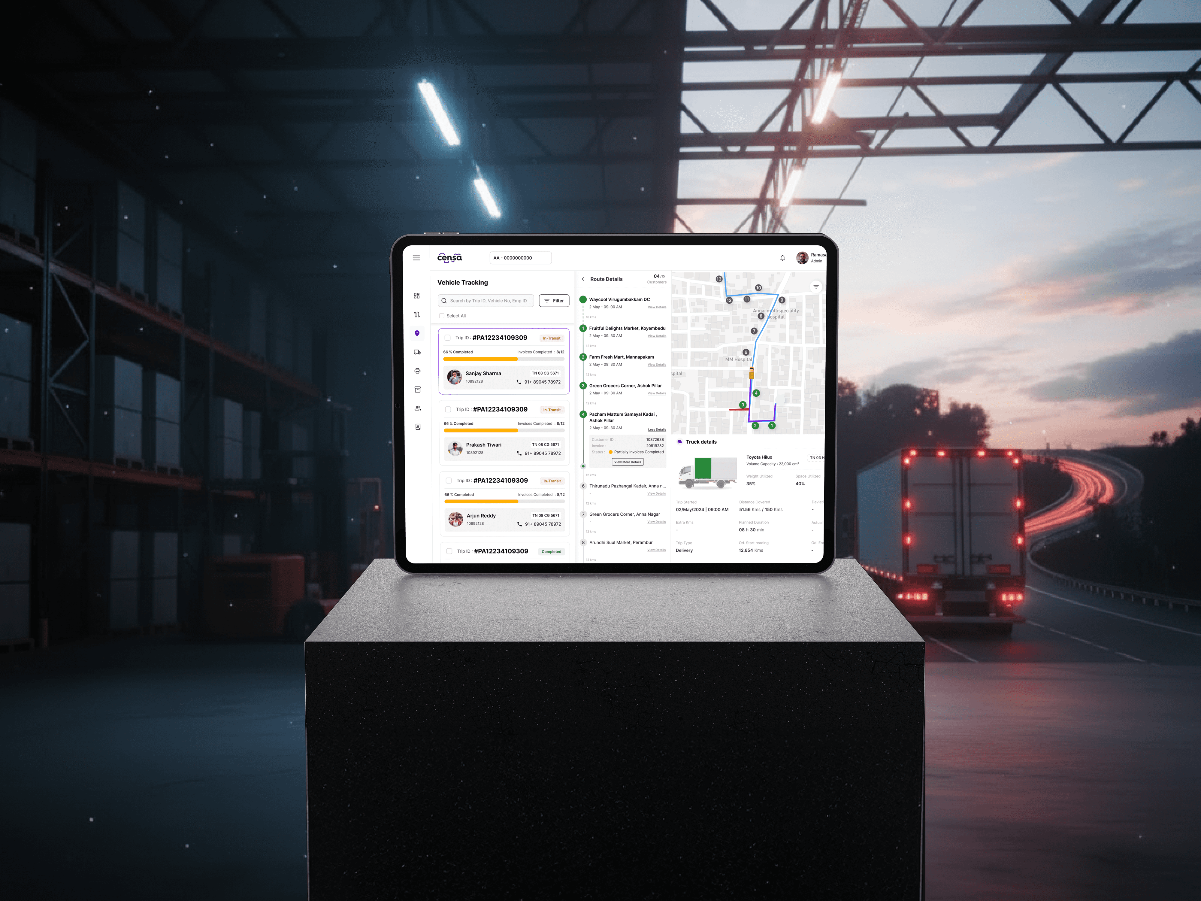
Due to fragmented workflows and poor visibility in the existing system, users like Gopaldas had to manually track information across multiple screens, making decision-making slower and less reliable.
User Persona
The primary users of the system are logistics managers responsible for planning and managing deliveries across multiple locations.
One of the key user types is a logistics manager like Gopaldas, who:
Plans delivery routes and allocates vehicles
Manages multiple deliveries and drivers simultaneously
Needs real-time visibility of vehicle capacity and delivery status
Makes quick decisions to optimize cost and time
Due to fragmented workflows and poor visibility in the existing system, users like Gopaldas had to manually track information across multiple screens, making decision-making slower and less reliable.
Key Insight
The problem wasn’t just complexity - it was lack of structure and visibility in the workflow.
Key Insight
The problem wasn’t just complexity - it was lack of structure and visibility in the workflow.
Approach
To understand the problem beyond screens, I mapped the overall structure of the platform to identify how different modules and workflows were connected.

Users often had to move between modules like Trips, Vehicles, and Deliveries to complete a single workflow.
For example, planning a delivery required checking vehicle availability, assigning routes, and verifying delivery status across different sections, increasing time and effort.
Approach
To understand the problem beyond screens, I mapped the overall structure of the platform to identify how different modules and workflows were connected.
Users often had to move between modules like Trips, Vehicles, and Deliveries to complete a single workflow.
For example, planning a delivery required checking vehicle availability, assigning routes, and verifying delivery status across different sections, increasing time and effort.
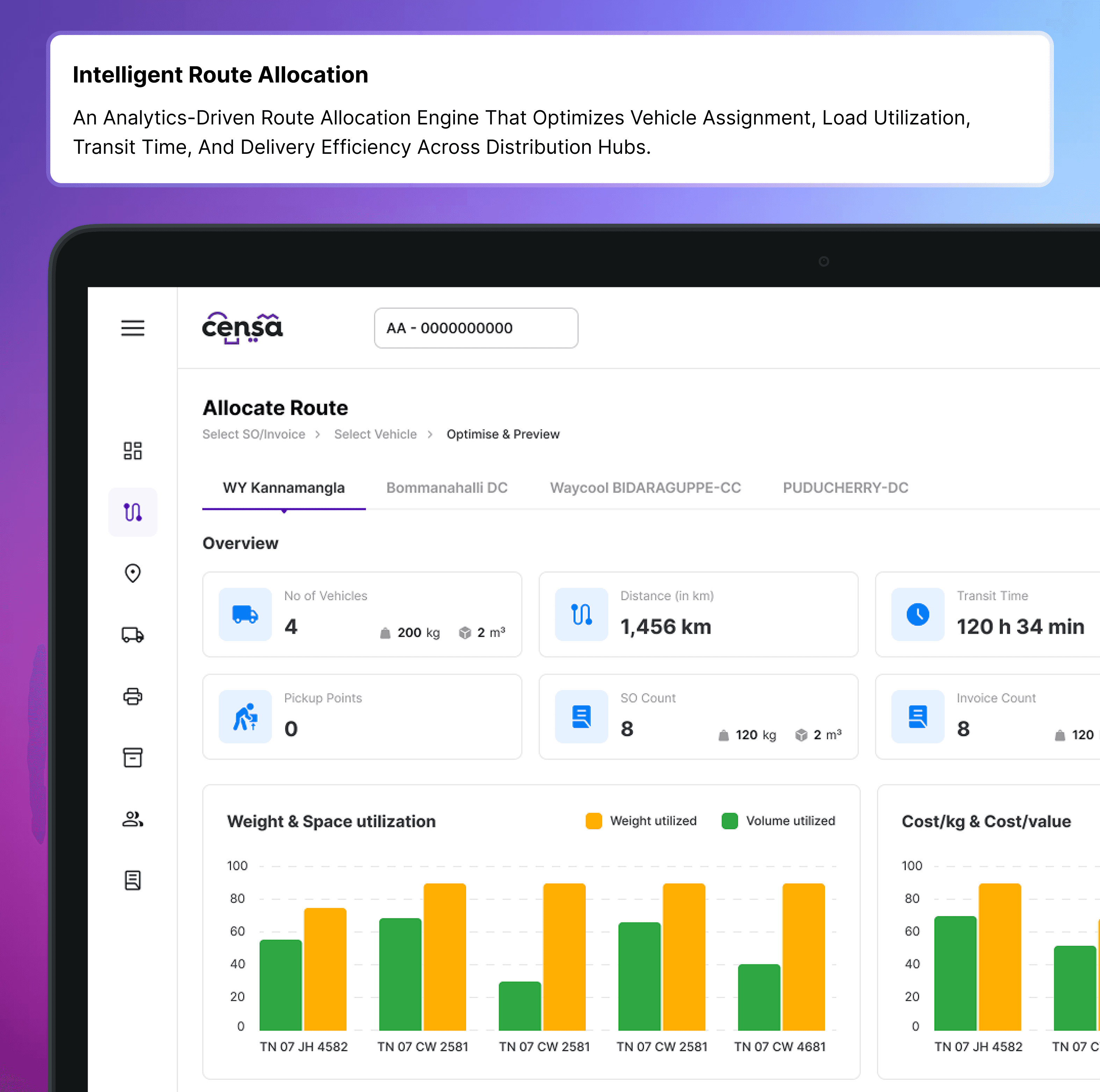
Solution
A workforce control center to manage drivers, delivery executives, and plant staff across distribution hubs.

Solution
A workforce control center to manage drivers, delivery executives, and plant staff across distribution hubs.


Outcome
Reduced dependency on navigating across multiple screens
Improved visibility of task status and workflow progress
Simplified multi-step workflows into more structured flows
Reduced cognitive load for users managing multiple operations
Created a more consistent and scalable system
Outcome
Reduced dependency on navigating across multiple screens
Improved visibility of task status and workflow progress
Simplified multi-step workflows into more structured flows
Reduced cognitive load for users managing multiple operations
Created a more consistent and scalable system
More Works
More Works


case studies or just WANT TO SAY HI?
LET'S CHAT
know more about me
LET'S CHAT