B2B Commerce
2022
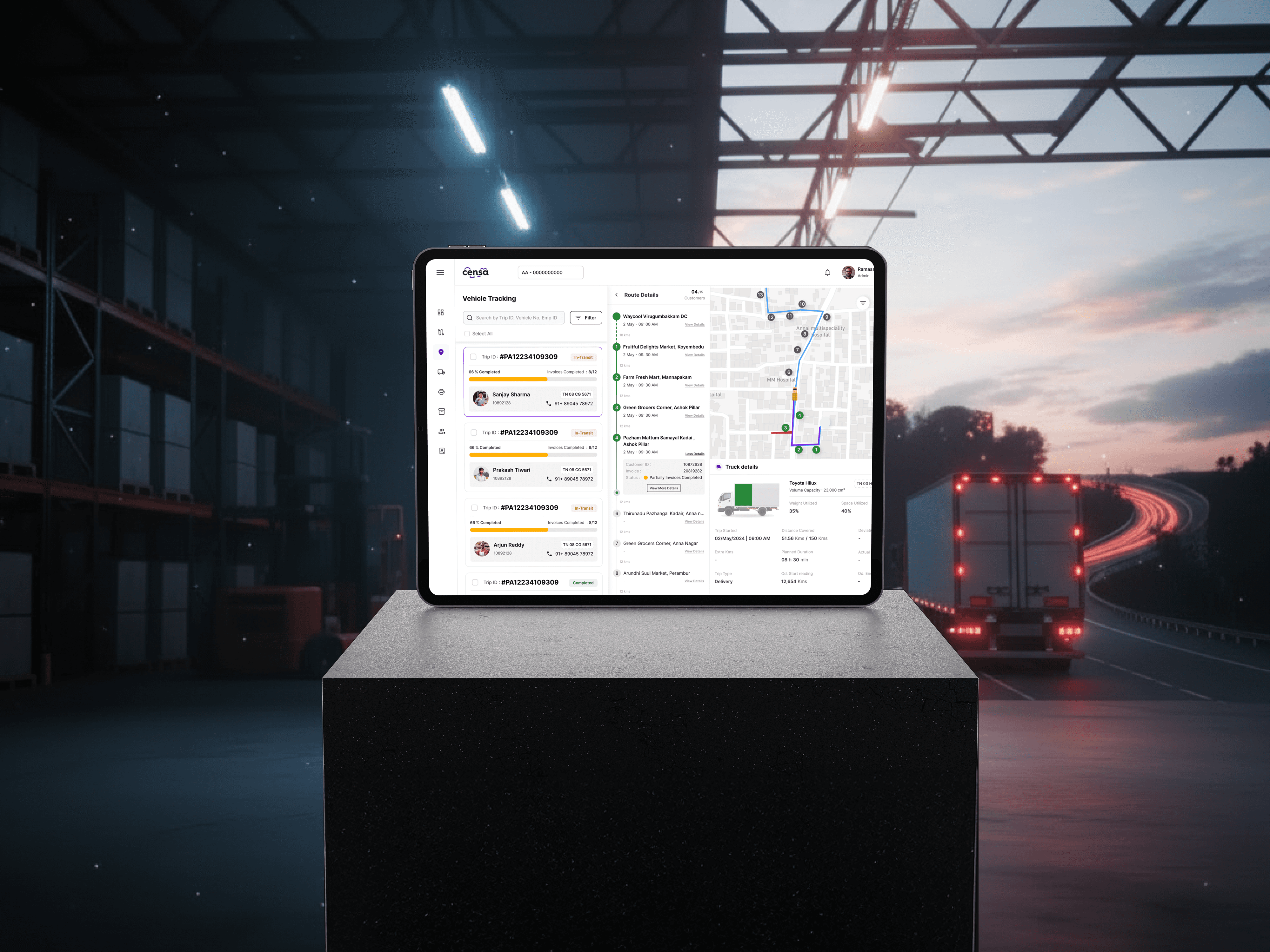
Waycool App
Simplifying Daily Ordering for Shopkeepers
Mobile
B2B Commerce
2022
Waycool App
Simplifying Daily Ordering for Shopkeepers
Mobile

Overview
Redesigned the Waycool mobile app used by shopkeepers to order fruits and vegetables for their day-to-day business operations.
The goal was to make the experience easier to understand, reduce effort in completing tasks, and improve how users navigate through the app. Waycool’s app is primarily used by existing clients to place daily sourcing orders.
Problem
The existing experience made it difficult for users to quickly find products, understand information, and complete orders.
Multiple actions and information competed for attention
Navigation required extra effort to complete common tasks
Important details such as quantity, price, and availability were not clearly prioritized
Users had to move across multiple screens to complete simple tasks
The experience felt cluttered and slowed down decision-making
User Context
Waycool’s users are shopkeepers who use the app while simultaneously managing customers, staff, and store operations.
They do not spend time exploring the interface. They need to:
Find products quickly
Reorder frequently used items with minimal effort
Understand pricing and quantity instantly
Complete orders as fast as possible
The app needs to support speed, clarity, and confidence rather than discovery.
Key Insight
Users are often making quick decisions while managing their store.
They do not spend time exploring the interface. They need to immediately understand where to go, what to do, and how to complete their order quickly.
Key Insight
Users are often making quick decisions while managing their store.
They do not spend time exploring the interface. They need to immediately understand where to go, what to do, and how to complete their order quickly.
Design Plan
Identified the most frequent user actions and prioritized them in the interface
Reorganized the app around the natural ordering journey: Browse → Select → Order
Reduced unnecessary navigation and surfaced important information earlier
Prioritized clarity and speed over adding more content
Solution
The redesign focused on simplifying the experience rather than adding more features.
Key actions were made easier to find
Information was grouped more clearly
The app flow was reorganized around daily ordering behavior
Visual clutter was reduced to make decisions faster
Solution
The redesign focused on simplifying the experience rather than adding more features.
Key actions were made easier to find
Information was grouped more clearly
The app flow was reorganized around daily ordering behavior
Visual clutter was reduced to make decisions faster


Outcome
Reduced effort required to browse and place orders
Improved clarity across the app experience
Helped users complete daily tasks faster
Created a cleaner and more intuitive ordering flow
Outcome
Reduced effort required to browse and place orders
Improved clarity across the app experience
Helped users complete daily tasks faster
Created a cleaner and more intuitive ordering flow
More Works
More Works


case studies or just WANT TO SAY HI?
LET'S CHAT
know more about me
LET'S CHAT